
Armstrong Gardens & Landscape – Promo Material Refresh
Commissioned to modernise Armstrong’s promotional materials—a main brochure, mini brochure for their UrbanPods partnership, and a matching voucher—using clean layouts and custom icons to enhance brand identity.
Context & Challenge
Armstrong Gardens & Landscapes is an Edinburgh-based company specialising in high-quality Garden Design, Landscaping, Maintenance, and currently have their partnership with UrbanPods modular garden solutions.
The challenge was that their promotional materials—brochures, inserts, and vouchers—felt visually inconsistent and dated. They needed a cohesive design system that would communicate their premium, eco-conscious values while working across different formats and audiences (residential clients, commercial partners, and UrbanPods customers).
Objectives
- Refresh the brand’s promotional collateral with a modern, premium feel.
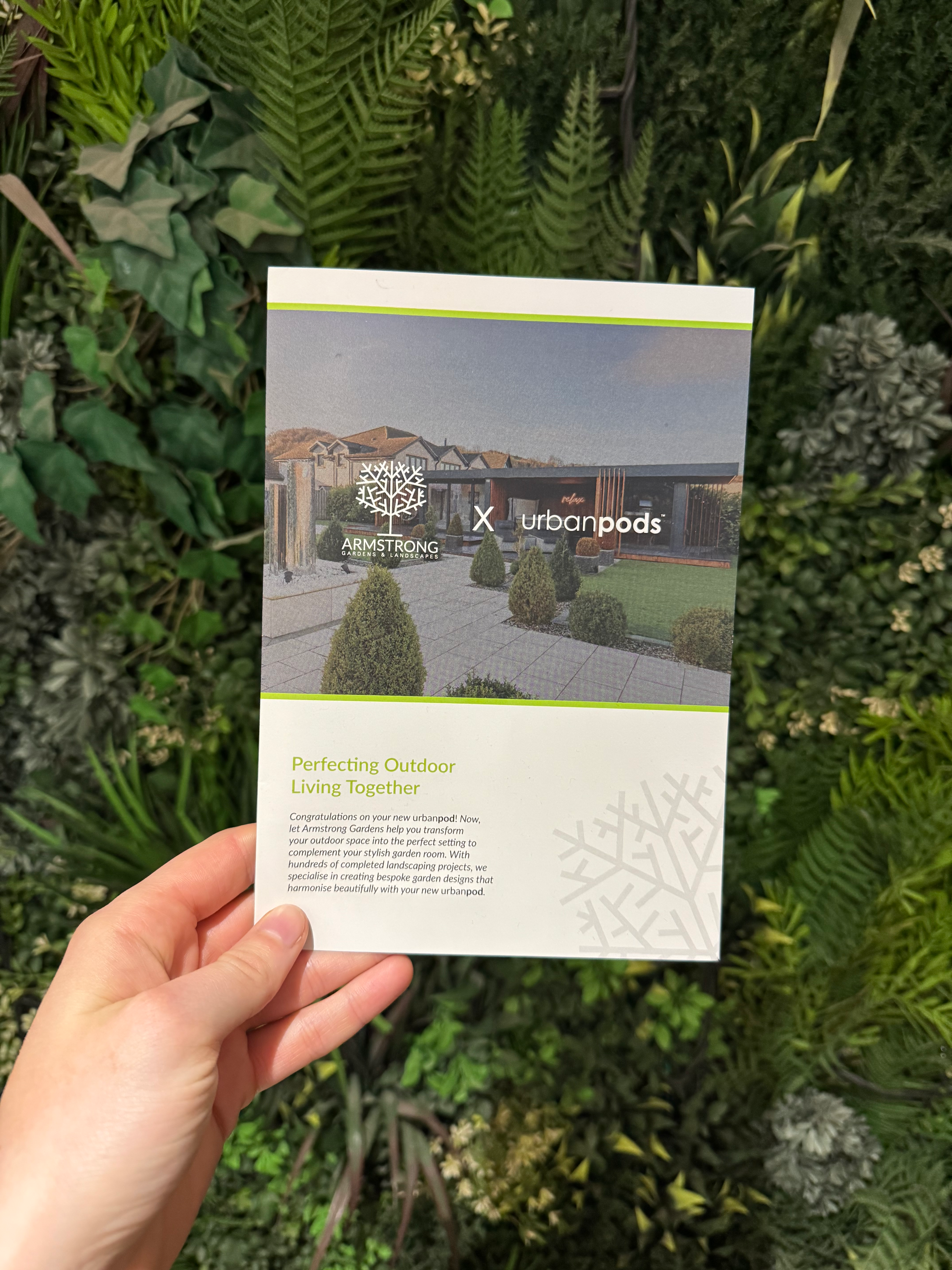
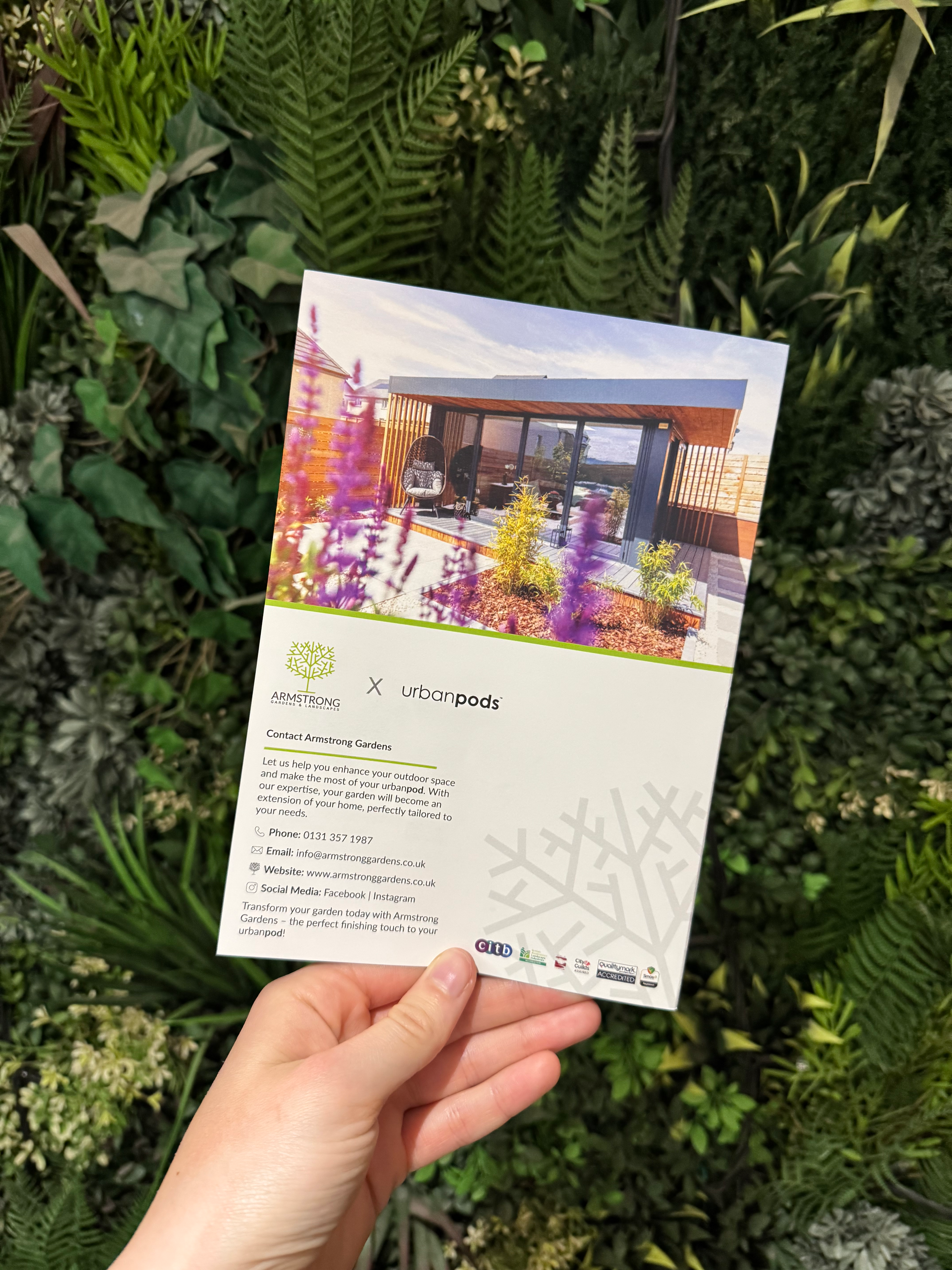
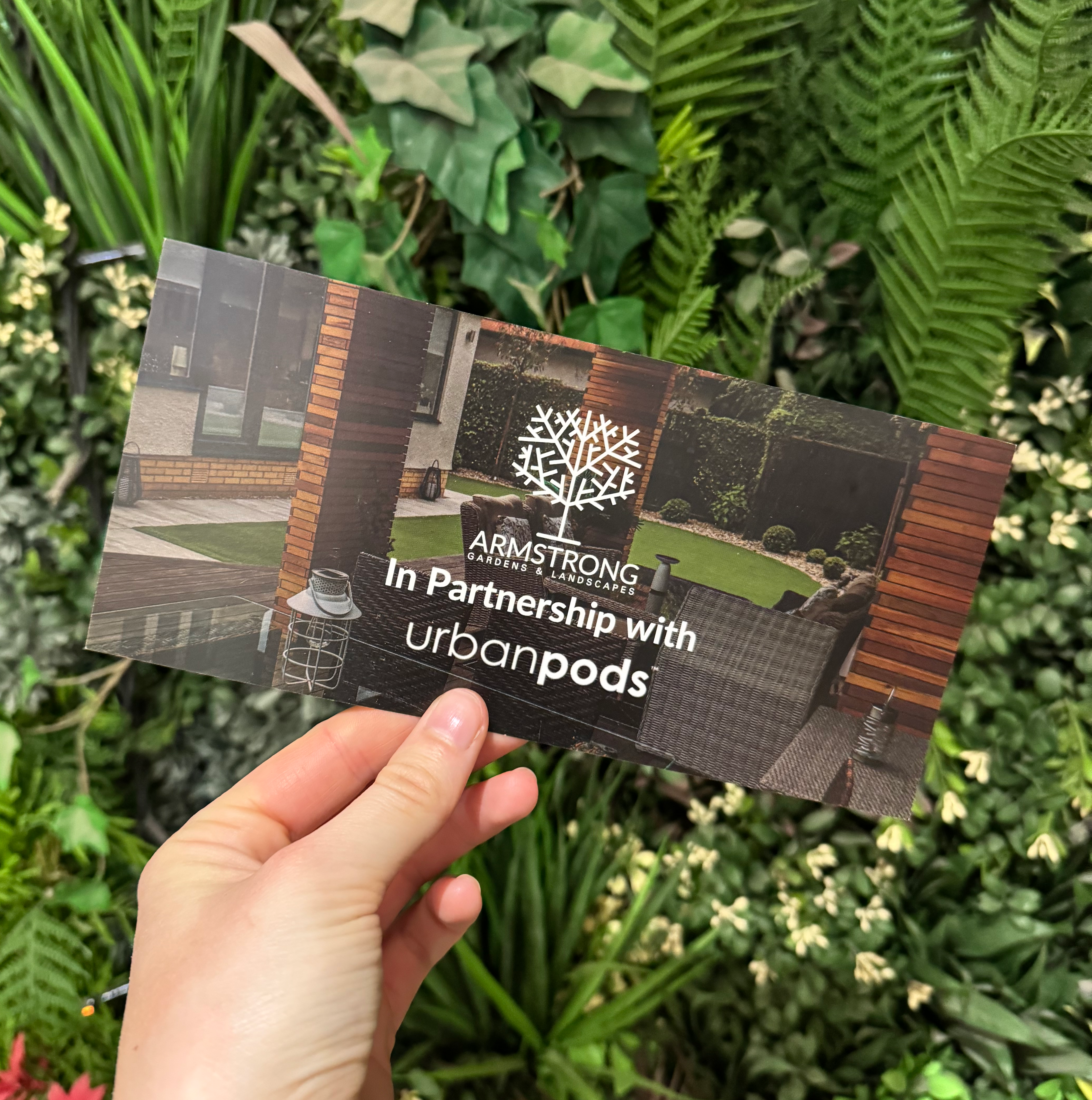
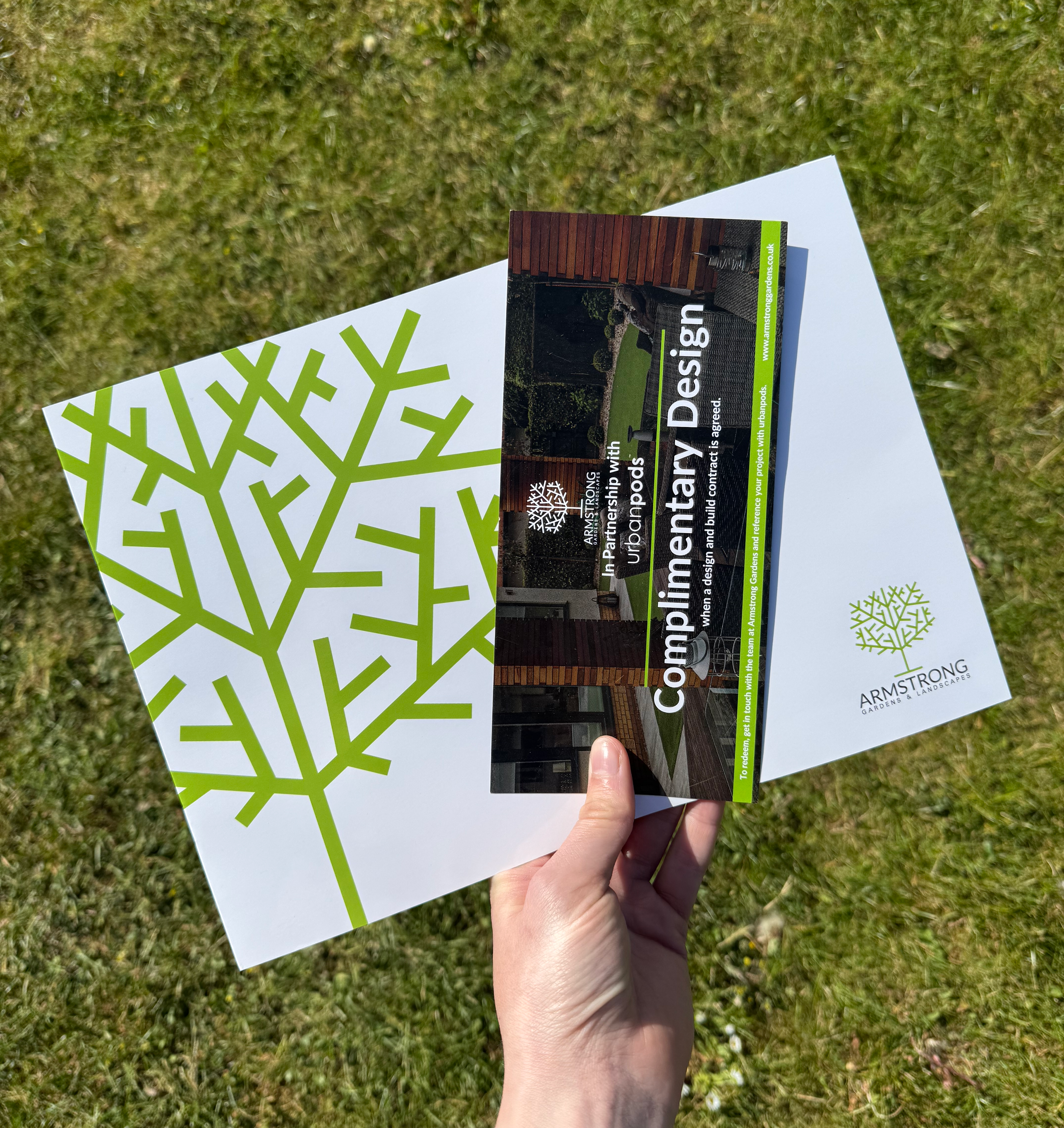
- Design 4-page main brochure, a mini UrbanPods insert, and a voucher
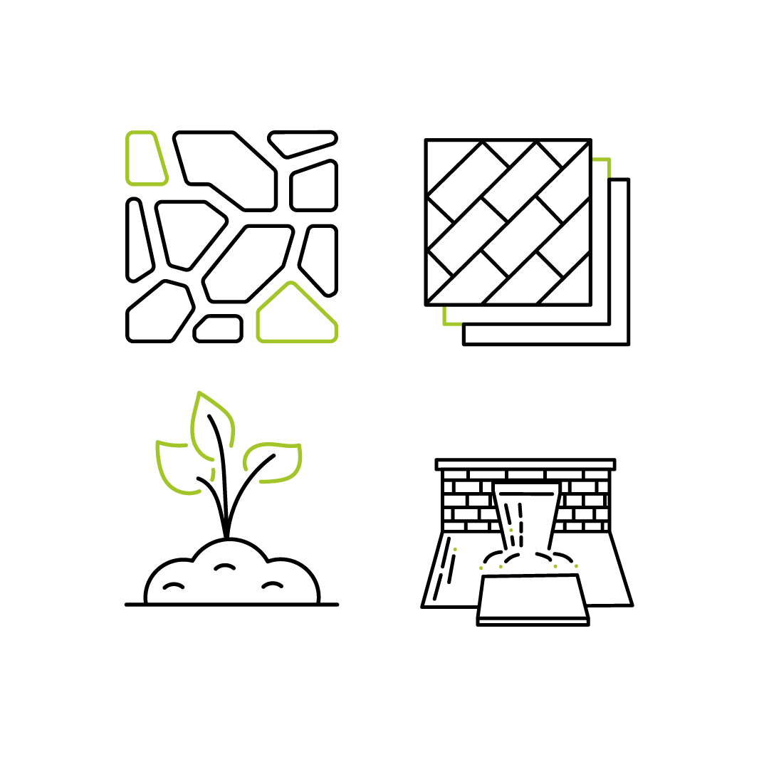
- Create a custom icon set to highlight services and reinforce identity
- Ensure consistency and versatility across all formats
Process
Research: Studied Armstrongs Garden and Landscapes website and Urbanpods , to identify common design assets in Typography, Layout and Icon Design.
Concept Development: Sketched icon ideas by hand, refining them into a clean, minimal line style with green accents.
Design Iteration: Built layouts in Adobe software, testing typography, grid systems, and imagery.
Client Feedback: Shared versions for review and refined based on hierarchy, tone, and clarity.


Solution
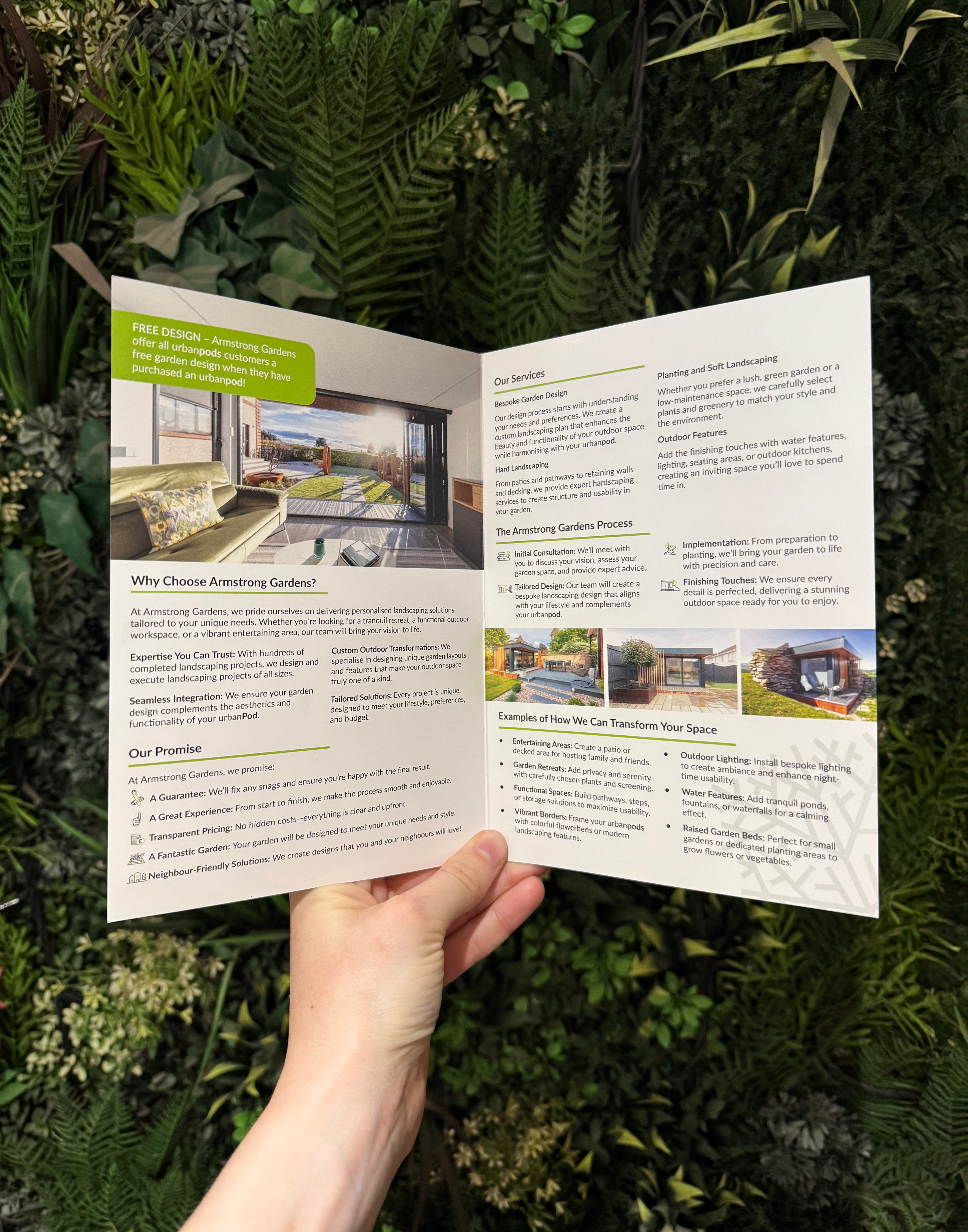
Brochure: A clean, grid-based layout with bold typography and a restrained use of green to emphasise Armstrong’s eco-focus.
Mini Insert & Voucher: Designed with the same visual system, ensuring all materials worked together as a family.
Icon Set: Bespoke service icons in a consistent line style, versatile across print and digital formats.
Outcome
The refreshed collateral presents Armstrong as a modern, professional, and environmentally-conscious brand. By unifying design across their brochures, inserts, and vouchers, their materials now speak clearly to multiple audiences while maintaining one cohesive identity.
This project strengthened my skills in print design, icon creation, and client collaboration, and showed me the value of creating a design system that works seamlessly across different applications.